COW is the go-to app for remote workers looking to break up their routine, explore new places and meet other like-minded people. The app targets an ever-growing market and provides a solution to the key negative effects of no longer working within an office environment.
Client
Brainstation Bootcamp
Duration
10 weeks
Role
UX Design
UI Design
Branding
Marketing
Tools
Figma
Invision
Pop by Marvel
Illustrator
iMovie
Context
Having been a freelancer since 2018 working both in a hybrid environment and fully remote, I struggled a lot with working from home and being on my own most of the time. At first, this all seems great, yet as time goes on the routine starts getting repetitive, you just want to get out the house, work and talk to people. This is a situation that not only I was facing, but thousands of other remote workers. With remote working set to increase, we have to rethink this set up to ensure people are happy and work efficiently remotely.

Design Process


Discover
Define
Design
Deliver
primary & secondary research. assumptions. interviews. affinity mapping. key themes. design question.
persona. experience mapping. user stories. primary & secondary tasks. task flows.
inspiration. sketching. wireframes. user testing. brand development. UI Library.
Hi-fidelity prototype. marketing website. multi-platform development
Discover


By 2028 it is predicted that 75% of all teams will have remote workers (1)
The benefits of working remotely
The negatives of working remotely
20%
blurrr
Creating assumptions about remote workers
Assumptions are based on facts about remote working that was researched through secondary sources. They address how my design can contribute to improving the problems remote workers are facing. This framework will enable me to develop my interview script in order to understand the problem space through primary research data.
Productivity
People are more productive working remotely than in the office.
Flexibility
Workplaces are becoming more flexible in allowing people to work from anywhere remotely.
Loneliness
People get lonely when working from home and would be happy to go out to find social interactions.
Routine
People enjoy mixing up work environments to break up the routine.
I interviewed several remote workers to understand how they feel about their work routine and social interactions. The results were analysed using the affinity mapping process, through which the pain points, motivations and behaviours were listed and grouped in order to understand the key themes my research should focus on.
Starting the conversation
Pain Points
Motivations
Behaviours
"Working from home can get lonely, especially if you don’t get out the house at all"
"Everything happens in my room: I eat, sleep and work in the room"
"It is too quiet at home, so I need to play music"
"I want to travel more and work from various locations"
"Working from cafes makes me happy and gives me a buzz"
"Seeing people work around me helps me focus and work better"
"I concentrate better in a place designed for people to work in"
"I like being around people with the same interest as me"
"I am happy working on my own but I also enjoy social interactions"
Key themes derived from talking to remote workers
Four themes emerged from the affinity mapping exercise, however, I will focus on two of these, which I believe offer the strongest space for intervention. The chosen two epics (key themes) are as follows:
1. Work Environment: Providing people with suggestions relating to the right space to work from depending on their particular needs
2. Social Interactions: Providing people with face-to-face interaction opportunities


The Design
Question
The design question was derived from both the primary and secondary research and seeks to help remote workers switch up their routines and socialise. As a designer, the focus question below helps me develop the persona and the user experience mapping, which ultimately highlights the design focal point that will drive my user stories.
How might we...
help remote workers find alternative working environments in order to switch up routines and socialise outside the house?

Define
The persona reflects the main user's attributes
The persona is a remote workers archetype; the person who will be using my digital solution. The listed pain points, motivations and behaviours are based on the interview findings and reflect issues and patterns that most remote workers are facing.

Finding the key point within a remote worker's journey
Experience Mapping is a way of describing the user’s experience interacting with a product or service. Pinpointing the low points within their journey allows for a design intervention - this will act as my design focus that the app will need to resolve and will also help me generate the user stories.
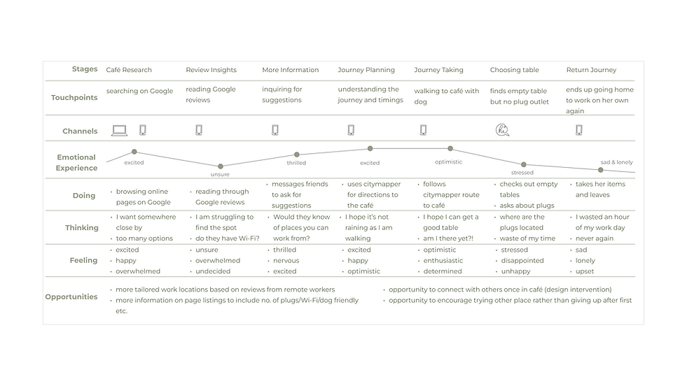
DESIGN FOCUS
Selected User Stories
Having developed 24 user stories which highlight the functional features a remote worker might need to undertake within the app, key themes (epics) emerged. I narrowed my selection down to two key epics which focus on the need for remote workers to find the right place to work and for face-to-face social interactions. The two selected user stories below will help me frame the user task flows.
As a remote worker I want to get tailored suggestions for locations to work from, so that I can work efficiently
Explore new places to work from
Primary
Task
As a remote worker I want to see who is working from the specific venue, so that I can start conversations and socialise
Check-in & see who else is working from the venue
Secondary Task
Mapping out the task flow
I have chosen to show the primary and secondary task flows within one, as they complement each other very well. The end-point/starting point for the flows is at the check-in screen. The task flow highlights the screens that will need to be developed in order to complete the tasks and helps me focus my digital solution on these two core tasks.
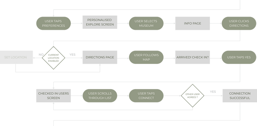

KEY

Design
The process of developing the right solution for remote workers
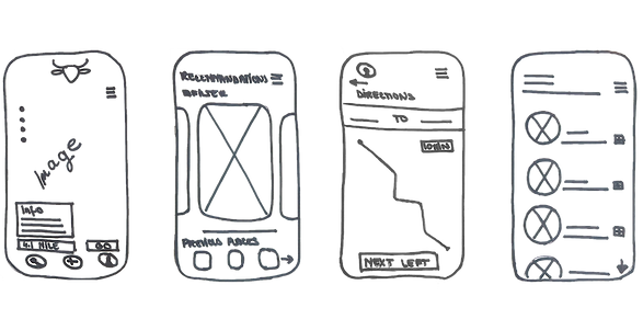
Discovering and defining the problem space has allowed me to start brainstorming possible solutions, as well as understand key solutions offered by competitors such as Yelp and Foursquare. A UI inspiration board was the starting point for me in developing the UI language that I seek to display within the app. The sketching exercise seeks to ideate possible solution screens, tools and features that I would like the app to consist of in order to follow the outlined task flow. From a few variations, I selected the final ones, which were then developed further into mid-fidelity wireframes.


Sketches
Assumptions are based on facts about remote working that was researched through secondary sources. They address how my design can contribute to improving the problems remote workers are facing. This framework will enable me to develop my interview script in order to understand the problem space through primary research data.
Home
Explore
Directions
Checked In Users
Converting sketches
to mid-fidelity wireframes
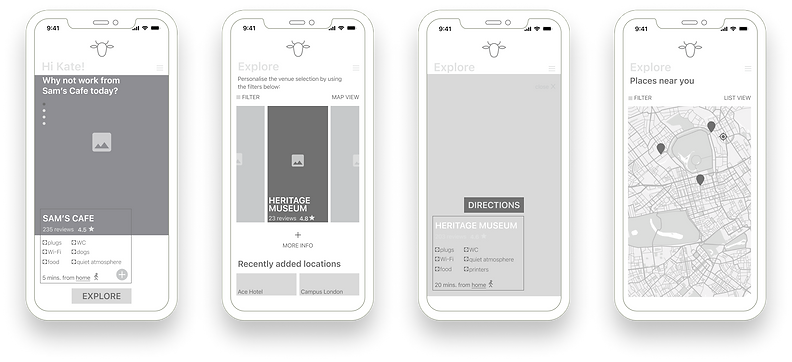
Home
Explore
More Info
Map View
The user can browse through daily suggestions of places where to work from
Horizontal carousel to explore various locations to work from and filtering these to work tailor preferences
The user can get more information about the selected location. The info relates specifically to work-related needs
This screen consists of the same information as the 'explore' screen but enables users to find suitable locations by panning over the map
Directions
Check In
Checked In Users
Successful Connection
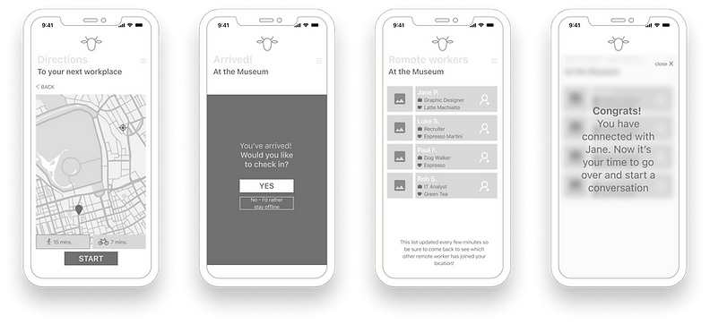
In-app directions will be provided to ensure the user can easily find their way to the chosen location
Once arrived, the prompt screen will allow users to check in in order to see who else is working from the same space and unlock discounts & offers
Other checked-in users are displayed on this screen and the user can connect with them before starting a face-to-face conversation
Once the other person has accepted the connection request this screen pops up. The app seeks to ensure a safe & respectful environment
Design development via user testing rounds
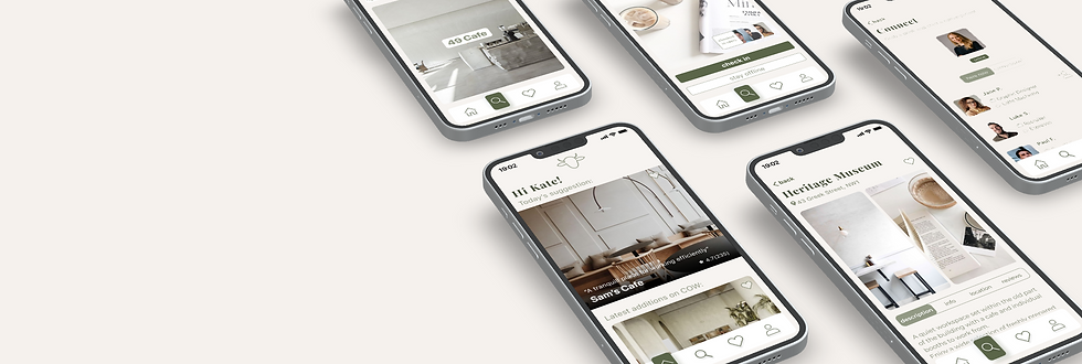
After the initial wireframe, I carried out two rounds of user testing with people who had never seen or used the app previously. After each round, the feedback was recorded and the solutions were mapped out within a prioritisation matrix and implemented before carrying out the next round of user tests. Below, I have shown the key changes between the first and second mid-fidelity prototypes. The focus of the changes has been on key usability issues highlighted throughout the testing sessions, as any aesthetic elements will be developed later on within the high-fidelity prototype.

Home
Explore
More Info
Connect

Deliver
Branding & Visual Identity
Based on my understanding of the users, the app should have a modern, sleek and minimalist look and feel that is easy to navigate for any audience. The patterns, colours and typography were derived from the developed UI board showcased below:


Typography &
Colour scheme
The inspiration board images reflect warm, modern and minimalist feelings that would be best translated within a sans-serif typography, which will act as the predominant font type throughout the app within the body text and CTA buttons. However, for the main titles, I opted for a serif font that is more playful allowing for softer touchers to be introduced and complimenting the body text well.

What does COW stand for?
Hovering on the images below will reveal the meaning of COW. The brand name was developed following a play on words that reflect the keywords that showcase what the app is about and whom it is intended for: workers finding new opportunities and connecting with other like-minded people.

COLLABORATION
COMMUNITY
CO-WORKING
C
.png)
OPPORTUNITIES
OFFICE
ONLINE
O

WORK
WHERE
WORKSPACE
W
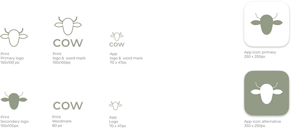
Developing the COW logo &
word-mark
My key inspirations for the COW logo are brands such as Apple or Twitter, which reflect the literal meaning of the brand name through a simple icon. The logo design for my app is a minimalistic interpretation of a cow's face using thin line weights and also providing a fully filled version as the secondary option. This is set within the brand colours, which overall reflects the mood of the app: modern & minimal.

COW allows users to explore new places, change routines, and connect with others.
Connect
Once checked in you can see who else is working from the same location and connect with them before going over and starting a conversation
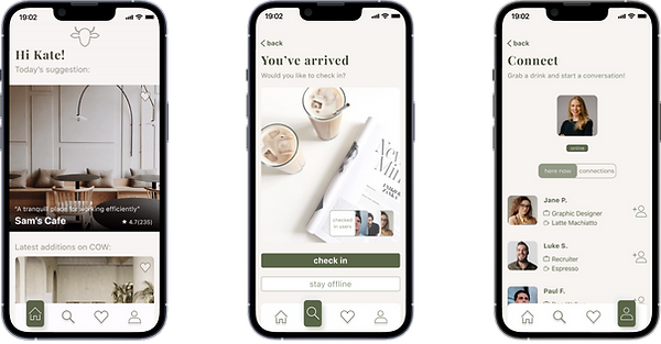
Unlock
Check into the venue to unlock discounts & deals that are exclusive to COW users. Checking in also allows you to view who else is at the location.
Encouraging
users to download the app
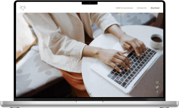

A marketing site for COW was developed by carefully using the brand's visual identity in order to give people the best reflection of the app and encourage them to download it. The intro video reflects four key activities that underpin the COW experience: explore, work, connect, and meet.
Thinking big
My vision for COW encompasses creating strong relationships with the locations we showcase within the app. This means creating opportunities for collaborations that would be beneficial for the app as well as for the businesses, driving more customers to them and providing our users with discounts. In return "featured on COW" can be a strong asset for businesses and a reflection of their excellence. This will be able to be showcased in the locations on doors (as below), coasters or at events.

The next steps in developing COW
The app is not limited to only remote workers: it can be used by students as well or anyone who needs a workspace that is free and easily accessible. The app will be able to expand worldwide and keep increasing its database; the more users sign up for it. The data collected such as people checking in and leaving locations will also help build a better app and predict business, an aspect that will be both beneficial to the businesses as well as the app users when deciding on the perfect location.
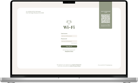
By creating partnership opportunities with businesses, there is room to take the app to the next level: encouraging people to download the app through a Wi-Fi prompt when they log into a COW-featured location using their laptop or tablet. I developed a desktop prompt screen that would direct the users to the COW marketing page once logged in, in order to encourage them to download the app and access all the exclusive discounts for the venue. The QR code also allows for quick download by scanning this using the phone.
THE END
Key learnings
01. Understand your users
Interviewing users whilst trying out the app was very insightful, especially watching their movements. The key takeaway has been to thoroughly note down their movements, ideally to have a video recording in order to be able to refer back to.
02. Iterate, iterate, iterate
Designs are constantly changing and the process of iteration is the key to the success of a product. The more iteration rounds you have the more improvements you can make in bringing the app closer to a perfect and seamless user experience.
03. Think big
The valuable lesson learnt has been to thoroughly understand the information architecture of the app in order to be able to expand on this later on. My next steps would be to design other user flows: such as adding a place to the favourites list.